
please empty your brain below
|
|
Good point - and "Towards Reading and Heathrow" is not particularly helpful when trains won't be doing that for some time.
Betterbee | 03.03.21 - 7:04 a.m. | #
|
|
Or simply fill the bottom 2/3 with advertising...
MK | 03.03.21 - 7:10 a.m. | #
|
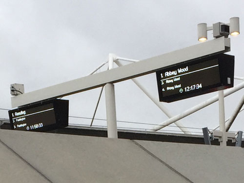
It's rather old fashioned for a brand new rail service to have a long list of destinations just rolled out like that. Why not "DESTINATION - 6mins 8mins 16mins" so it's less space, larger font, more accessible. Something reflective of the nature of Crossrail, rather than looking like any old departure board for any old service?
If Crossrail is truly going to be so "turn up and go" then why show trains in 100+ minutes anyway? Oh look, Norman, there's a train in 20 minutes and 120 minutes, let's chance the later one? I think not.
DoktorbPR1 | 03.03.21 - 7:10 a.m. | #
|
|
They should just make them like this Paris indicator -- with one line per destination. Crystal clear.
anon | 03.03.21 - 7:13 a.m. | #
|
|
Presumably because changing them means paying the company twice.
Kirk | 03.03.21 - 7:19 a.m. | #
|
|
Seems like a good Minimum Viable Product. They'll have plenty of time to "improve" things.
Jochem | 03.03.21 - 7:45 a.m. | #
|
The designers/architects probably thought the panels look better in portrait though landscape would be more functional.
That said MK above has probably nailed it.
Kevin | 03.03.21 - 8:14 a.m. | #
|
The point is they double as information boards in time of disruption. So some or all of it could be reconfigured to show real time messages.
Besides, I like to see how consistently the service is running.
Pedantic of Purley | 03.03.21 - 8:35 a.m. | #
|
|
Reminds me of the fancy new live departures board at a regional airport, which lists flights several days ahead, because they only attracted a single airline to fly from there. It looks really busy until you realise there are max two departures per day, so maybe the Crossrail boards will keep this display to signal their ambition/scale/massiveness.
commonliner | 03.03.21 - 8:44 a.m. | #
|
|
It must be difficult to find something new to moan about everyday.
Messiah | 03.03.21 - 9:21 a.m. | #
|
|
The Oslo metro shows only the next train to each destination on the displays, which I always found to be clever. It shows exactly the information required at all times.
Erling | 03.03.21 - 9:27 a.m. | #
|
It is much harder to change these types of things than you think, so better to put them into what will be, rather than what will only be temporary.
Doing it this way also allows for months/years of testing, so there won't be complaints come 202x when they have the full amount of services. Differing destinations will appear at some point, possibly overnight I would imagine.
And, as others have said, not having to pay for 3 lots of development.
R2 | 03.03.21 - 9:29 a.m. | #
|
I cannot find a picture showing what the boards look like on the platforms. It could be they are this style as when a train approaches they flick to the long list of stations served. Remember, not all trains will have the same stopping pattern.
I assume for simplicity all stations are getting the same kit even if it appears excessive close to the ends of the line.
Personally I like the style. Reminds me of the full colour screens they installed at Baker Street Met. Always thought those were very stylish.
ap | 03.03.21 - 9:56 a.m. | #
|
|
The boards on the platforms at Custom House aren’t like this. They’re simpler dot-matrix-style displays showing the next train, and under that sequentially the 2nd, 3rd and 4th.
diamond geezer | Homepage | 03.03.21 - 10:09 a.m. | #
|
|
A good point on the subordination of usability to design, notwithstanding that I think notwithstanding really doesn’t mean what you think it means.
Rich G | Homepage | 03.03.21 - 10:29 a.m. | #
|
|
Having been a very long-time reader of this blog, 'installed by muppets' is the phrase that comes to mind - or in this case, 'programmed by muppets'!
Cornish Cockney | 03.03.21 - 10:57 a.m. | #
|
|
Departure Board M?
RogerB | 03.03.21 - 11:38 a.m. | #
|
|
Visual clutter. A new line deserves better than this.
Malcolm of Kent | 03.03.21 - 1:21 p.m. | #
|
Requirements/Scope problem, as mentioned by others.
The curse of standardisation, keeping development cost down by having a standard solution (hardware & display format) that works for the most complex station, without including in scope the ability to configure to show less/different data, support smaller screens in different orientation (adaptive/responsive)
Or maybe it does, but only using the default config until some later date/someone complains
MilesT | 03.03.21 - 2:13 p.m. | #
|
One thing I note is the screen headings. Why is 'Heathrow or Reading' split onto two lines where 'Abbey Wood' is on the third line on its own?
towards
Heathrow or Reading
would work just as fine and, in my opinion, look neater. (Putting 'towards Abbey Wood' on one line would be ideal, but the linebreak is needed on the Westbound, so best keep as is.)
RG | 03.03.21 - 4:10 p.m. | #
|
|
|
TridentScan v2.10.0 | Privacy Policy
|