
please empty your brain below
|
|
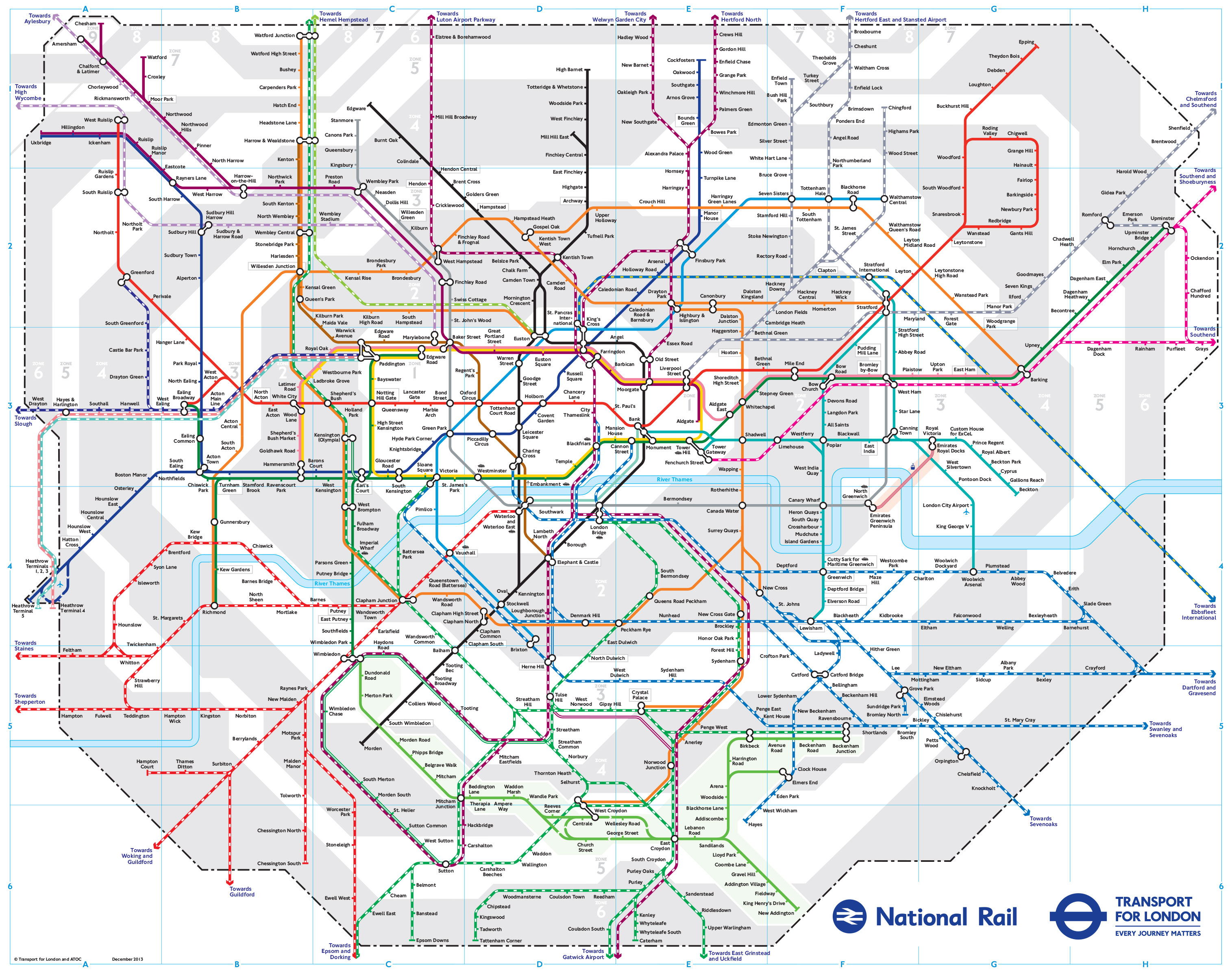
The green fare zone does make it much clearer. But trying to improve the presentation of the Sutton loop on the tube map makes me think of pigs and lipstick.
Alan | 18.12.20 - 7:43 a.m. | #
|
Yes that's less of a mess, although not having the zone 4 area extending further into the bottom left hand corner means that there isn't a decisive barrier between zone 3 and zone 5.
Trams - given the two slightly different shades, the 'tram zone' might be better represented against some form of patterned background.
Still Anon | 18.12.20 - 8:20 a.m. | #
|
|
The bottom left hand corner is the edge of the map, where the key goes.
diamond geezer | Homepage | 18.12.20 - 8:24 a.m. | #
|
They have in the past used various shades of colour to highlight the zones, as opposed to just grey and white. For example the so called the travelcard zone map.
If they had say a (fictitious) deadline of 01 January to put the maps on the shelves, at what point does the design have to be finalised?
Thomas | 18.12.20 - 8:44 a.m. | #
|
|
The tram zone is already a different shade on the tube and rail map. It was even pale green on the 2013 version.
NickW | 18.12.20 - 8:53 a.m. | #
|
|
Your green tint is both an elegant solution to the 'problem' and a way of emphasising that the Tram is very different to a Tube train.
Petras409 | 18.12.20 - 8:58 a.m. | #
|
Quite apart from the zones issue, this extract demonstrates one example where the map is geographically innacurate without good reason. I would move Merton Park, Dundonald Road and Wimbledon further south which would be neater, flattening that upward bulge in Thameslink, and would put Wimbledon in a more sensible position relative to other stations.
Another example would be Farringdon as you showed us yesterday. That could be solved by bending the underground to run parallel to thameslink between KXSP and Farringdon. They will need to do something anyway to get it closer to Barbican if crossrail is ever added.
Also the Overground towards Watford Junction could be diagonal so it is nearer to Watford.
kev | 18.12.20 - 9:40 a.m. | #
|
|
For what must be the (quick estimate) umpteenth time, DG proves that TfL should at least offer to employ him.
Chz | 18.12.20 - 10:41 a.m. | #
|
|
...or the trams could just be removed as they're no more relevant on a Tube map than showing one random popular bus route.
A | 18.12.20 - 10:51 a.m. | #
|
|
I would add a vertical line below Sutton Common to close off zone 5, or a shallow right angle triangle in the bottom left between Morden South and St Helier.
Still Anon | 18.12.20 - 1:01 p.m. | #
|
... or just remove the tram zone highlight altogether, and note in the legend that all tram journeys are a flat fee, with no zoning applied.
The positioning of the Wimbledon area stations is a mess. Stretching the District Line down a bit would allow all the Wimbledon-area stations to be closer together, remove the ugly upward loop from Haydons Rd to Wimb, and could also allow a walking-link line between South Wimbledon and Wimbledon, as this is just about walkable.
I think the original reason for the massive gap on the map between Wimbledon and South Wimbledon is because this is where the map legend used to fit.
ChrisMitch | 18.12.20 - 8:07 p.m. | #
|
All this demonstrates is the absurd complexity of the London public transport network, sadly unintegrated in operations, ownership and fares (Oyster being the one universal bright spot).
This is sadly typical of the UK: in Europe, it would be unimaginable to have such a primary map that omitted major routes such as Waterloo-Wimbledon or Victoria-East Croydon while including secondary ones (including the tertiary Thameslink loop), or to have to introduce such distortion as is highlighted here because of the self-inflicted would of an unintegrated fare system.
Good old British muddling through! (or not.)
Betterbee | 19.12.20 - 7:51 a.m. | #
|
The green zone is such an elegant design solution.
Good work.
ADS | Homepage | 19.12.20 - 12:32 p.m. | #
|
Sorry if I’m being daft - where have they published it? I still can’t find it online.
dg writes: They still haven't.
Gresham Boyse | 19.12.20 - 11:54 p.m. | #
|
|
|
TridentScan v2.10.0 | Privacy Policy
|