
please empty your brain below
Green branding is not a very good colour for the colour blind.
I remember when London bus routes were first given over to private companies and there were buses of many colours depending on the company. 65 was orange, H25 white and there were others that were blue, not by route but by the companies colour. It confused passengers some of whom thought they were not London transport buses and so did not get on them. May have been Ken Livingston who got them all painted red again.
Not sure if I like the new colour by route idea. Most people have a smart telephone now and can easily check the route, and the bus stops also list the places that a bus route number stops at.
Having the route number displayed larger on the bus front would be useful but it seems they have chosen put it on the side. Not sure how well the colours used over the red will be distinguished at night under the various colour spectrum outputs of different types of street lighting.
Also TfL haven't taken any lessons from the adverts on the side of the buses, the commercial advertising has very few words in big letters, TfL has lots of small writing, most of which is illegible even to someone standing quite close.
Why not have the blinds in the same colour too.
With the map, showing the parks, the lines are too thick and they should be showing other tourist attractions, such as Walthamstow and Romford Market, Barking Abbey for example.
I like the 247 branding with the yellow, but the places are just wrong. They should be Barkingside, Fulwell Cross, Hainault, Hainault Forest, City Pavilion, Collier Row, Romford.
Now you mention it I remember the 24 from when I lived near Gospel Oak. It was operated by Grey Green and was, er, grey and green in colour.
I, and am sure many others, will remember the garish 19 operated by Kentish buses. I lived near Rosebery Avenue at the time and was a frequent user (of the 19) . Yuk.
The bus stop branding is a great step, however - I have occasionally flagged down the wrong bus where I've looked up a route on the spider map and then confused it with another route with a similar number at the same stop. Branding the timetable and the flag with colours is very helpful. However, with my relatively minor colour-blindness, it would still be quite difficult to distinguish between some of even this set of colours used. I also lament the loss of the spider maps.
Whilst the sceme is slightly less useful for the colourblind, it's still a clear improvement over just having the number on the front, and it's not as if we can't tell significantly different colours apart.
dg writes: No Boris buses here, no.
An accountant somewhere will point out that it costs more to indiclvidually paint and rebrand buses in different colours now and for maintenance in the future (when routes change) and will do the sums, come up with a figure, at which point it won't happen when they realise how much it will cost - at a time when revenue is already down due to the introduction of the two buses/hopper.
The accountants of any business almost always have the final say, no matter how good an idea it might be.
Fabulous as always dg
If the colour branding is to work, it's got to be done properly. First group are pretty good at this and often paint the front top half in a bold colour. Unfortunately, with modern bus designs, there is too much glass and not enough panelling. And we all hate Contravision (obscuring windows with promotional messages).
How about applying the colours to the black masked area around the destination box? I seem to recall that Capital Citybus used that area with pleasing effect, some years ago.
Final point, having frozen all the fares, TfL must need every penny it can get, so the use of the giant advertising space surely can't last long.
Final, final point...Will all over adverts be required to coordinate with the route colour?
A simple marketing message.
And if it's rolled out, as been pointed out, it's going to be really tricky to get no place where two two routes with the same or very similar coloured routes meet.
Na, I'm afraid this is just headline grabbing stuff that I suspect will quietly be shelved.
And there is an interesting problem with buses being used on other routes.
I now live in Greater Manchester and my main local bus routes are the 383 and the 384. There's a very busy route nearby operated by the same company called the 192. It's pretty much the only branded route in the area that the company have. Its buses have a giant 192 on the front windows and messages telling everyone that the service runs up to 18 buses an hour.
But at the weekend they have a tendency to throw the buses on the 383 and 384 for whatever reason (where the normal double deckers that ply the routes are, who knows.) So you have a giant 192 on the front, with a bus destination blind saying 383.
Even more odd was the 'Happy Chinese New Year' branded bus that was running in the area for ages. It was supposed to be running on services that went near Manchester's China town. Instead it spent many months wandering around the suburbs.
School buses also throw up some quirks, but that's also to be expected. Still, the sight of a "Magic Bus" going past my house with its huge cartoon wizard, does amuse me.
Also worth mentioning that the continuing trend of having "24 hour" routes makes things a lot simpler than having N-prefixed versions with a slightly different route — if you're only out late occasionally it means you can then rely on your knowledge of the regular routes rather than having to look it up.
Wouldn't it be better to show:
25 in 2, 3, 5, 6 mins than just repeat the same bus over and over?
If a garage is short of a bus they're going to bring out whatever is available.
I can't see the point of it, think it will cost more than it generates, and will be just too complicated to implement London-wide.
It is dumbing down. We've managed perfectly well with our iconic buses up to now!
Reading is quite good at keeping buses to their correct routes but other operators, like Arriva or Carousel in High Wycombe, are much more careless and frequently use buses with incorrect branding which seems self defeating.
What worries me more is the bird shit style paint splatter on the upstairs front window. I assume this looks particularly rubbish when you are sitting up there and part obscures your view of the delights of Barkingside.
One reason this won't really spread is the loss of advertising space. I bet you won't see every bus on a route losing whole bus sides to Tfl branding rather than income boosting ads.
Then in 1906 someone came up with a brilliant idea - give each route a unique NUMBER, prominently displayed on the front of the bus. There are, after all, a literally infinite number of distinct numbers. You could even put the number on an interchangeable board, so the bus can be switched between routes as needed, according to demand and maintenance needs.
It'll never catch on - they'll be trying to get rid of the horses next............
Spider maps are fine as they are - this sounds like they've been dumbed down
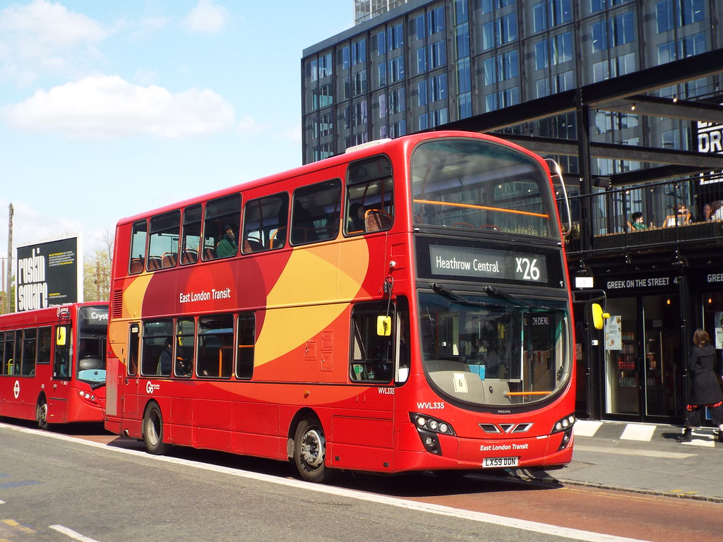
Buses do stray from route to route, foir all sorts of reasons - look at the "East London Transit" branded buses currently on the Croydon - Heathrow X26
"at the weekend they have a tendency to throw the [192-branded] buses on the 383 and 384 for whatever reason (where the normal double deckers that ply the routes are, who knows.) "
Operating Rail Replacement services perhaps.
It used to be quite common for some bus garages to be closed at weekends, with the others having enough vehicles to cover the sparser timetables. Also, at one time, you saw OPO buses (with doors) at weekends on routes that had crewed Routemasters during the week.
All blinds are moving to the simplified (final destination only) black and white model for legibility reasons. The yellow on black is slightly more legible in daytime, but is significantly more difficult to read at night. The front blind is still the definitive answer to "what bus is this?" that must be as legible as possible at all times. Which is why they're removing the intermediate stops (hell, they're confusing as well) from them. And apparently moving them to the side.
As for the cost of painting busses, I'd make a decent bet that it's a vinyl sticker. It's not something you can add in a jiffy, but they come off awfully fast if you need to redeploy elsewhere.
One of the things about the 192 fleet is that they're hybrids so it may be as simple as them using the hybrids on other routes when they have a bus spare. Although the weekend frequency of the 192 is quite similar to the weekday one, there presumably must be a couple of extras floating around.
How daft is this?! As others have said, once branded these buses can only run on their allocated route. Talk about tying their hands up.
Anyway, by far the majority of travellers know where they're going and what bus they're getting.
Even if you're in a strange area of London and you need a bus there's stacks of info out there. In trouble? Ask! Why spend all this wedge to help a few clueless people?!
I, too, see this fizzling out.
And this new thing will explain why the spider maps around Orpington are still wrong after the rehash. Well some of them any way...
Instead of single colours that are hard to distinguish (especially under streetlighting with poor colour rendering), use Amsterdam-style square icons with different colours and shapes. These give far more combinations and can be instantly changed using LED displays or even the ancient roller blinds that TfL still insists on using.
But the biggest problem still remains, the utterly daft concept of removing all the intermediate stops from the front of the bus. It's imperative to have the route summary instantly visible so that you know which bus to sprint towards.
It'll never work.
Vinyl stickers on buses solve a problem which is already being solved by technology.
This colourful branding feels like something from the past, not 2017.
You might be able to see real-time bus locations on your phone, or get a minute-accurate ETA from Google Maps, but millions of people aren't enabled with that technology or skillset.
Also, bus stop dot matrix signs are installed at a minority of bus stops.
Because of people spotting their required bus and darting over the road, (with inevitable consequences) these were blanked out and discontinued. The modern artwork designer is obviously oblivious to such safety concerns.
Also, a couple of longer routes are Sapphire routes, with Wi-Fi chargers by seats and a speaking display. Hilariously, the 320 announces that the next stop is 'Hemel Pavilion', instead of 'New Civic Centre'...the pavilion music venue was knocked down about 15 odd years ago...
Btw, branded busses work elsewhere (including one branded "9 - Ride the Wave" near me). They should work in London too. Plus it lets you add a route map _inside_ the bus, which is sorely lacking.
Around Colditz and Leipzig in Germany their on bus displays show the next three stops coming up, which was how I knew when to change on that journey in a foreign place I had never been. Easy peasy.
As someone who is often too vain to wear my specs, I like this experiment. It makes it much easier for those without 20/20 vision to identify the route without squinting at the bus blind - which can be difficult to read at a distance. Could be really useful in Bishopsgate which has both route 35 and route 135 - and they use identical bus types so even harder to distinguish until the last minute.
The phone apps are great but if you're heading towards a stop and haven't fired up the app, a quick glance at a colour stripe will be really useful in knowing whether to run for the bus or if it's not the route I want.
They only needed eight colours for the whole network, yellow excluded for obvious reasons, but two of the colours (red and dark blue) match the livery of the town's other bus operator Morebus. Which will be confusing if they ever decide to colour the buses.
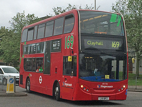
Does this 169 bus go to Newbury Park? Not so long ago you could have seen at a glance.
As usual, Improvement Means Worse !
And it seems DG has done a wonderful public consultation job that would have cost Tfl a fortune had they had brought in consultants to do it for them.
London, with its enormous, necessarily tangled, web of literally hundreds of routes, dozens of different operators, and a tricky who-does-what boundary between operators and TfL, is not ideal. As others have said, there are probably better ways to spend any available improvement funds than this half-baked effort depicted here.
But all credit to DG for doing the actual journalism, which it seems that none of the actual journalists have bothered with - unsurprisingly, given the lack of time and money and the "regurgitate" option being attractively dangled in front of them.
dg writes: I thought there might be something innovative and interesting on board like that, but unfortunately the upgraded buses are currently so rare I never managed to catch one.
At least the 38 used to form a cute heart between the middle of the 3 and 8.
"I think the tfl tender process allocates a specific number of buses (and it specifies the actual bus type) for each route."
Not quite - it specifies a timetable which necessitates a specific number of buses on the road - the "peak vehicle requirement" (PVR) is the number of buses needed in service at the busiest time of day. It is up to the operator to decide how many vehicles it needs in its fleet in excess of PVR to ensure that it can meet this requirement, allowing for vehicles off the road for repairs or routine maintenance.
1. It is a trial. We don't know how long for. The marketing effort is being done "in house" to keep costs down.
2. It is clearly focussed on generating off peak travel hence the choice of "points of interest" and no mention of purely residential areas like Hainault or Becontree.
3. The current concept could never work on all routes. If TfL decide to deploy this then it will be restricted to parts of the network with defined local routes.
4. I note the admonishment above about not using colour blindness as some sort of excuse. Well I'm colour blind and struggle to distinguish some of the colours deployed in this trial. Therefore I won't be using the colour themes at all. I'll stick to numbers and my own knowledge. There are colour coded maps used in this country and elsewhere which are appalling to use if you are colour blind. I'm astonished TfL have not considered this given their inclusion and accessibility agenda.
5. 25% of the vehicles allocated to a route will NOT be branded. This gives flexibility in the event of breakdowns or other problems. I have read that the blind boxes have been locked to specific route numbers thus preventing deployment on "wrong" routes.
6. Routes 167 and 462 are currently getting brand new, eco friendly single deckers. Seems odd to spend the money on new buses but not advertise the fact!
I'm with the sceptics as to whether this will work. We've been here before and LT and TfL are notorious for "big bang" initiatives that then wither and disappear due to lack of day to day management and commitment. It takes money and effort to do branded routes properly as evidenced by all the examples in other posts where people notice it being done badly. I understand TfL will be trialling other things but no news yet as to what they are.
Example here. (Not my pic.)
http://londonbusesbyadam.zenfolio.com/p218306534/h2D09EF0E
Route 36
Route 12
Route 13
Routes 15 and 15A
TridentScan | Privacy Policy